In my first 7 case studies I took half finished mazes or completed mazes that weren’t very good and improved them. If you want to read those case studies the links are at the end of the post. Today I want to take you through a series of mazes I was happy with, but still thought it could be improved and challenged myself to do the slow work of improving it.
I asked a friend for some feedback and they thought every color maze was better than every black and white maze, with only a few exceptions. My thought was, let’s take the time to color a few mazes of the week from this week and see if color improves them or not. I ended up doing 9 different mazes, with 2 getting a lot of extra attention. Today we look at 7 of the mazes.
Museo Soumaya Maze
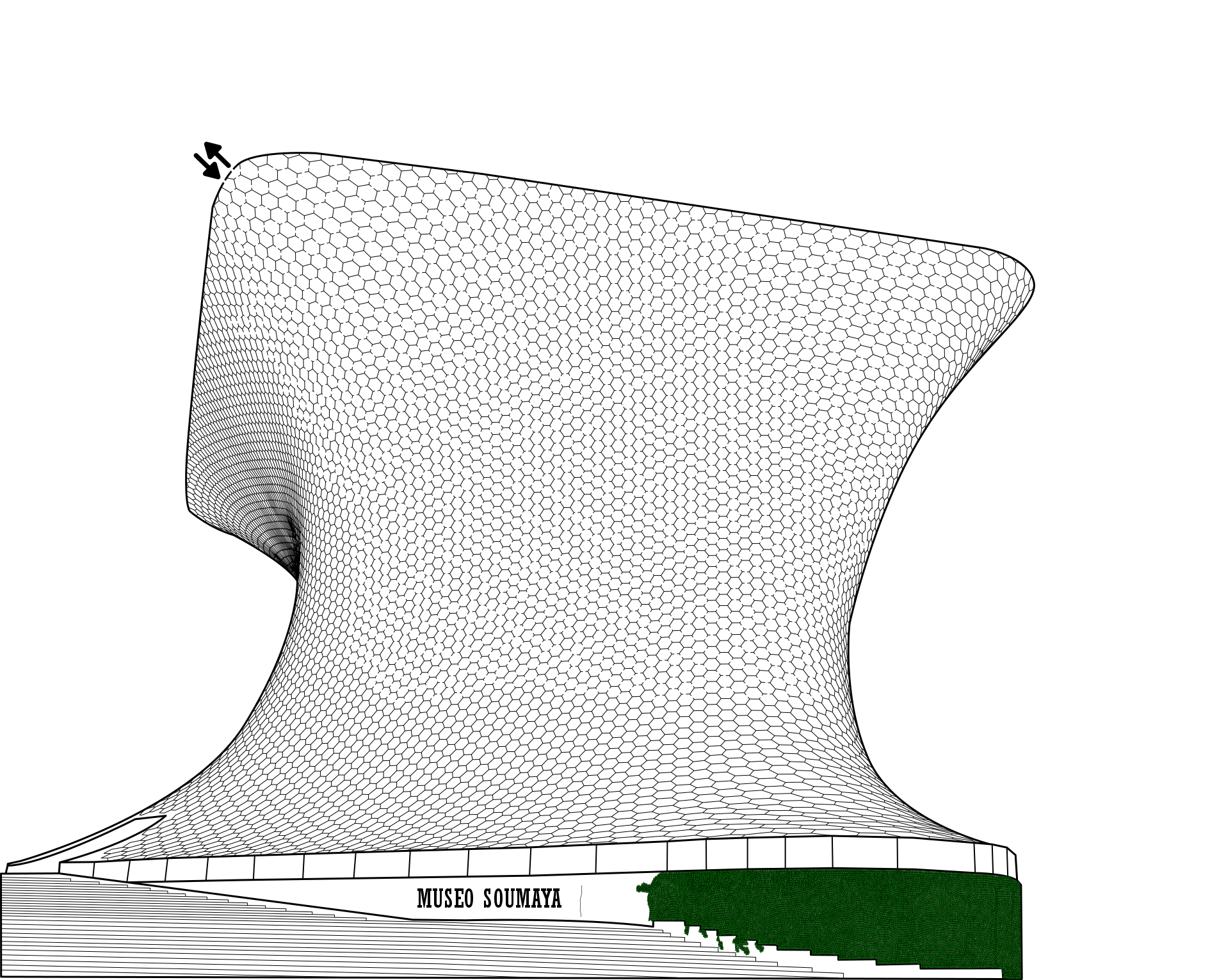
Let’s look at that original maze, also known as the ‘before’:
The building has a unique shape, and while it is a black and white maze I did give the leaves that cover the front color so people could see what it was. The revised maze:
Some simple coloring, but shadows give the building more shape. I think this is a slight improvement !
Heydar Aliyev Center Maze
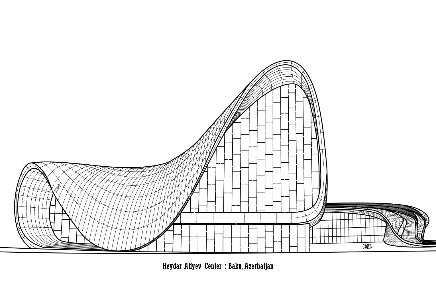
A beautiful white building seemed natural to stay black and white.
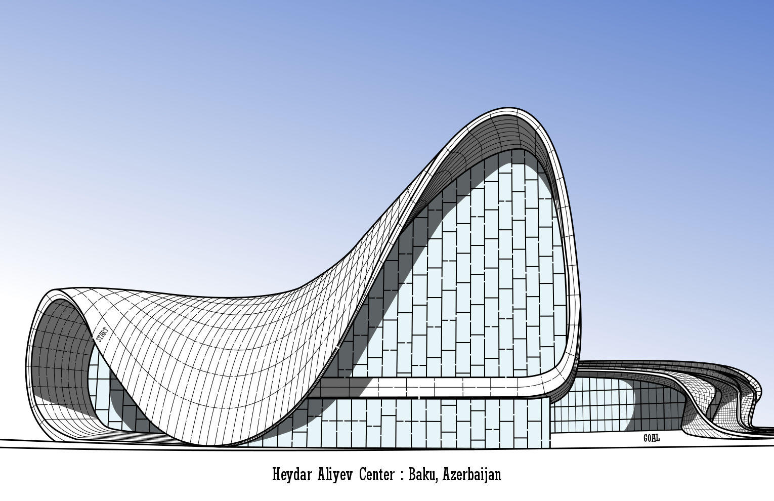
But in the revision I added a blue sky that helps to pop the white building more, and added shadows to give the unique building more shape on the page. Personally, I think these minor changes make the maze much better !
Lotus Temple Maze
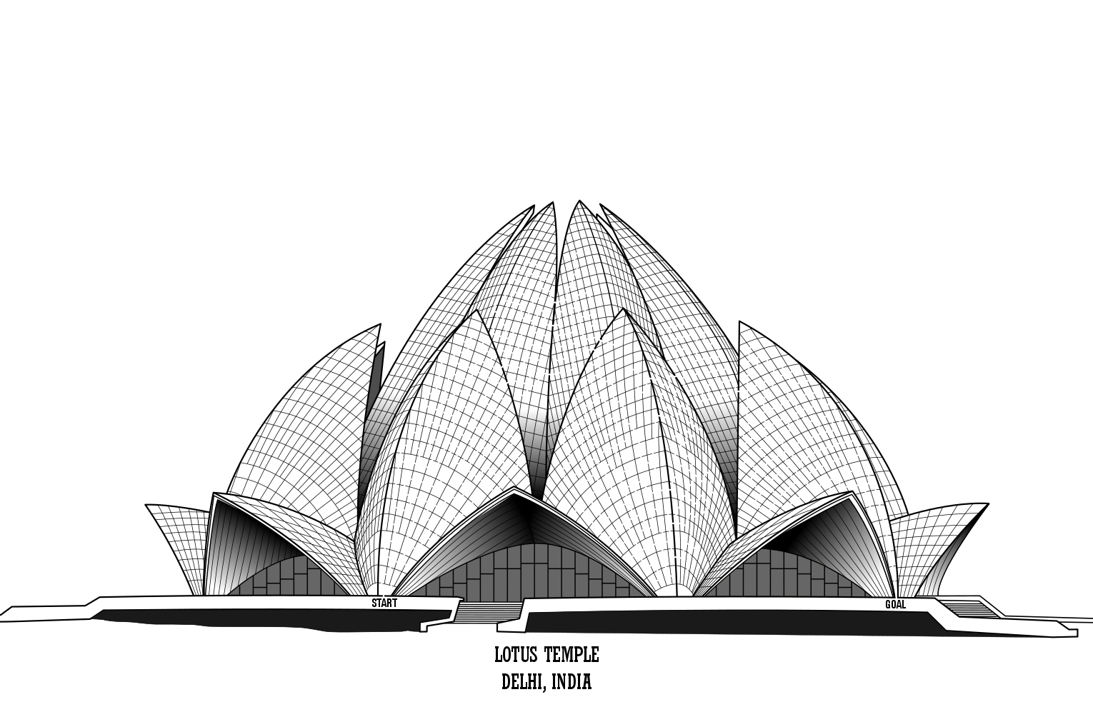
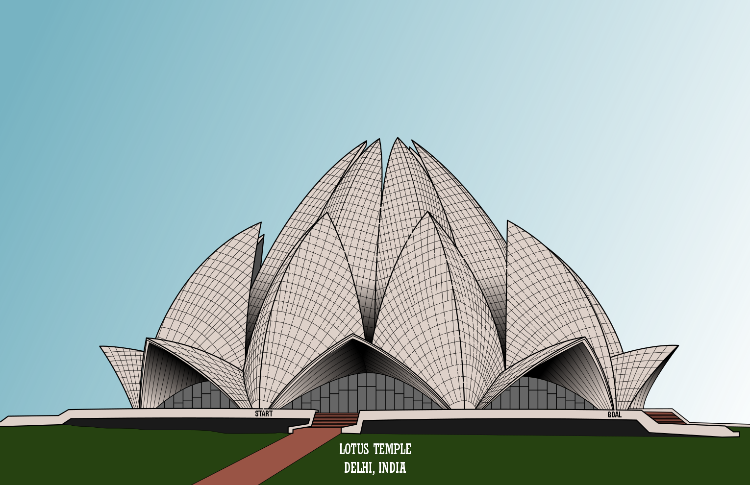
This is another building that is an off white color so I left it in greyscale. I did originally add shadows to the maze to show the unique shape, and that really worked.
For the revision I added a sky, an expanded pathway and grasses. I’m not sure if this is an improvement. I think I prefer the original.
George Rogers Clark Memorial Maze
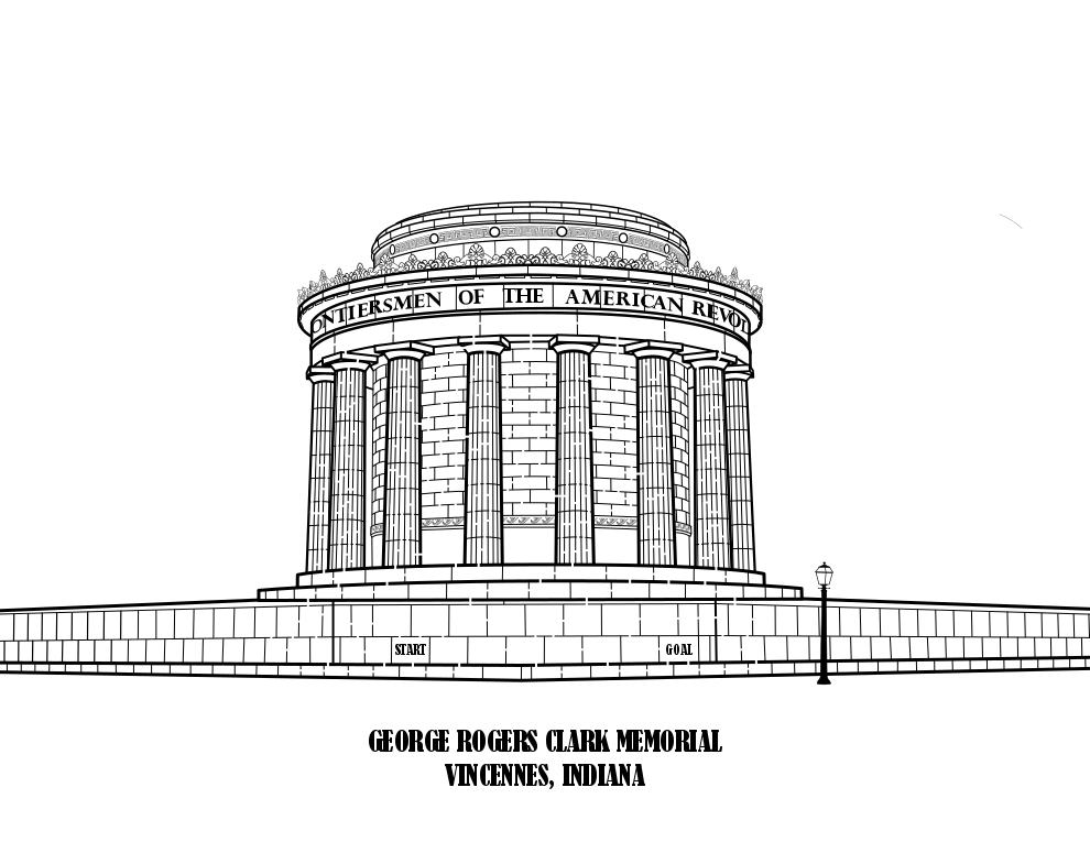
This was a random maze I made because I liked the building. I also liked how it looked in black and white.
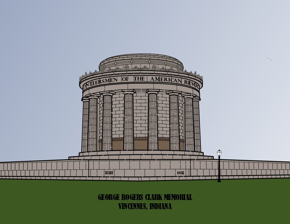
The revision only includes 4 colors and gives you a better feeling of what the building actually looks like. Either maze is ok for me. I considered shadows…but no.
Bagan Temple Maze
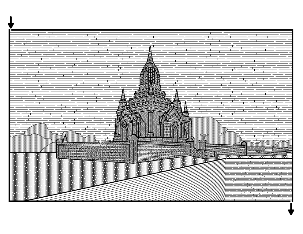
I did this maze off of a photo I took and used a different technique of drawing different spaced and thickness lines to make it. I generally do not use this technique anymore. I also no longer “maze” the sky.
Adding color inside the frame makes this look different, almost like a postcard. I think I prefer the original, but in color it is ok.
Pro Football Hall of Fame Maze
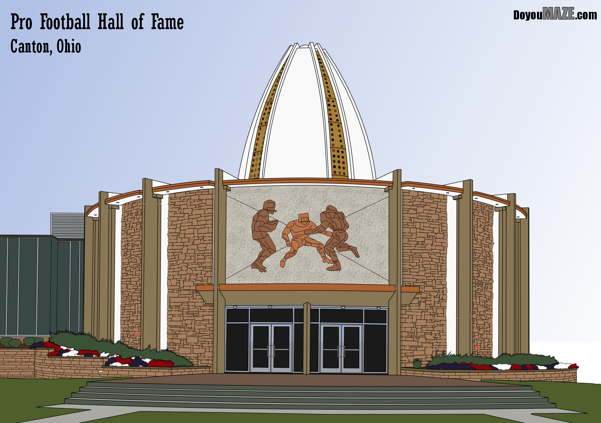
I always knew this should be in color. The stones on the building are multicolored. I have done individual brick/stone colors before and it is tedious.
But I think the addition of color, especially with the plants in front and the small windows on the football roof make this much better in color (even if I went with one brown for the stones).
Elm Road Theater Sign
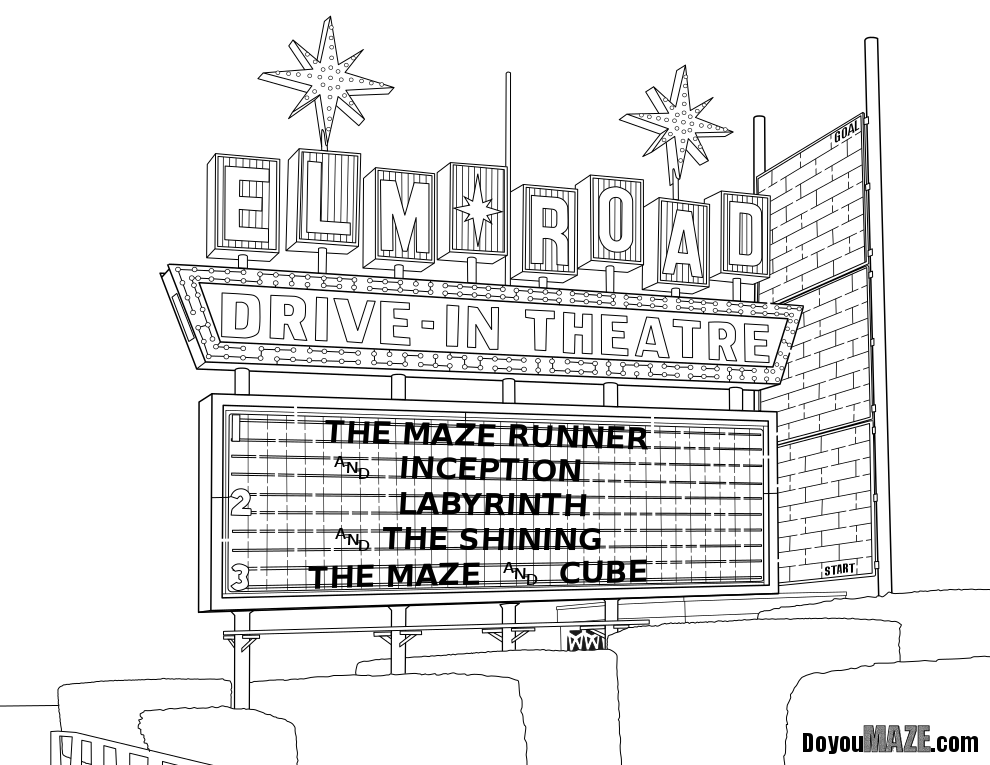
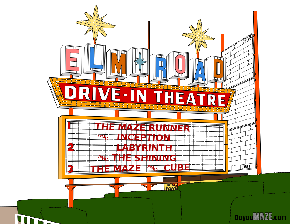
This weeks maze was a last minute switch ! Here is the original.
And here is the much more colorful version! I like both, but the colors really pop and give you a better sense of what the drive in sign looks like !
So that concludes this case study…some mazes look better in color, while others do not. Overall adding color is a good thing thought because when it works, it really works. So that was 7 mazes of the 9 I colored. The other 2 mazes get their own case studies (#9 and #10) because I did more work on them, and have more to discuss besides a before and after. Also, they look great (IMO) so stop by soon and read about them !
If you want to read the previous 7 case studies:
Case Study#1 - How to Improve a Bad Maze - Tiki Totem Maze
Case Study#2 - How to Improve a Bad Maze - Danzante Conchero Chichimeca Maze
Case Study#3 - How to Improve a Bad Maze - Red Rocks Amphitheatre Maze
Case Study#4 - How to Improve a Bad Maze - The Hollywood Sign
Case Study #5 - How to Improve a Bad Maze - Severance Hall

