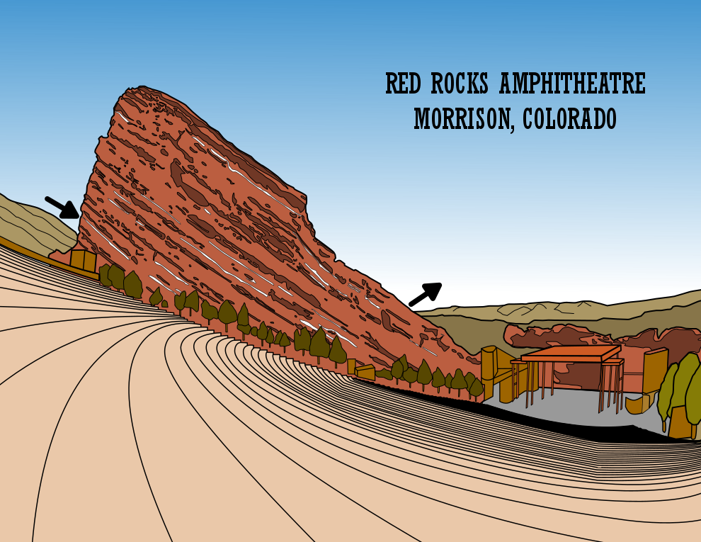
Now here are the changes I made to (hopefully) improve the maze:
1. Color - I changed some colors to be less cartoonish. Tree trunks brown from a mustard color (even if you can’t see them). Buildings that were mustard toned to browns. Seating area from a pink tone to more of a brownish tone.
2. Layering Fixed - This is somewhat minor, but there was a layering problem under the trees where the seating ends. In this area there are small concrete or stone shelves between the seating and the rockface. I fixed this issue to expose them as intended.
3. Seating changed - I changed the searing area to include more accurate seats vs. walking area.
4. Start and Finish change - The arrows are a distraction from the picture. It says this is a maze clearly but I changed this to an internal START and GOAL that is less distracting.
5. Maze addition - I went with freehand drawn internal walls within the exposed rockface. I did not want straight lines in the rockface.
6. Zoom Change - Now that the maze was on the rockface and that was the focus I zoomed in to feature that, losing some of the previous details in the stage area. I had thought it was important to show the entire stage but now I disagree with old me.
7. Letter and branding changes - Changed the sizing of the name of the maze and it’s location (floating int he sky before was terrible) and added my branding to the top right corner.
I also did some minor clean up of details in the maze.
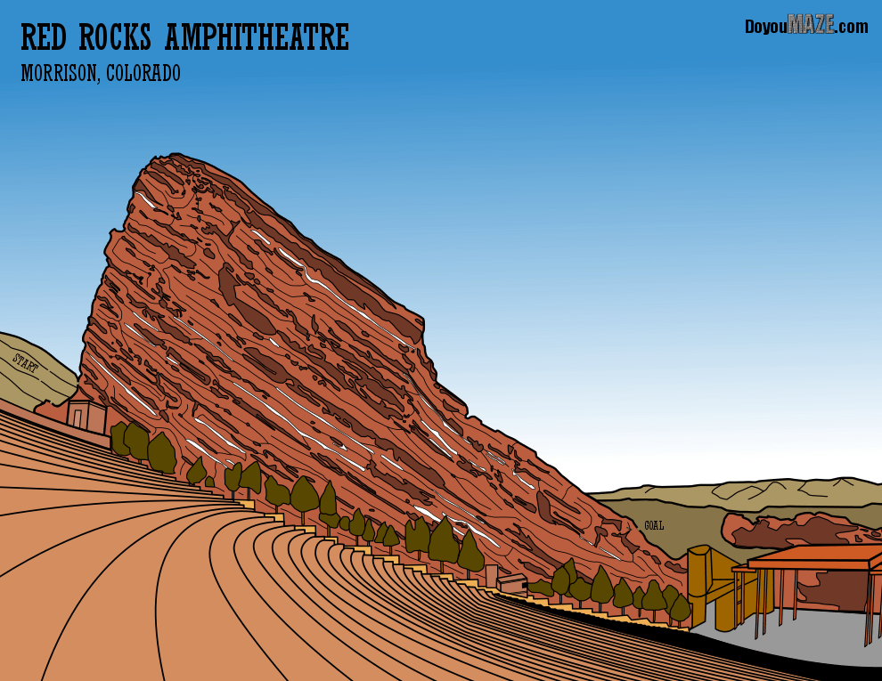
FINAL THOUGHTS
Better. I considered changing every tree but decided against it. I think the zoom in and the color changes made a big difference.
And now the “After”. The new maze: