Maze of the Week 99 Redux - Berlin Planetarium (MOTW#165)

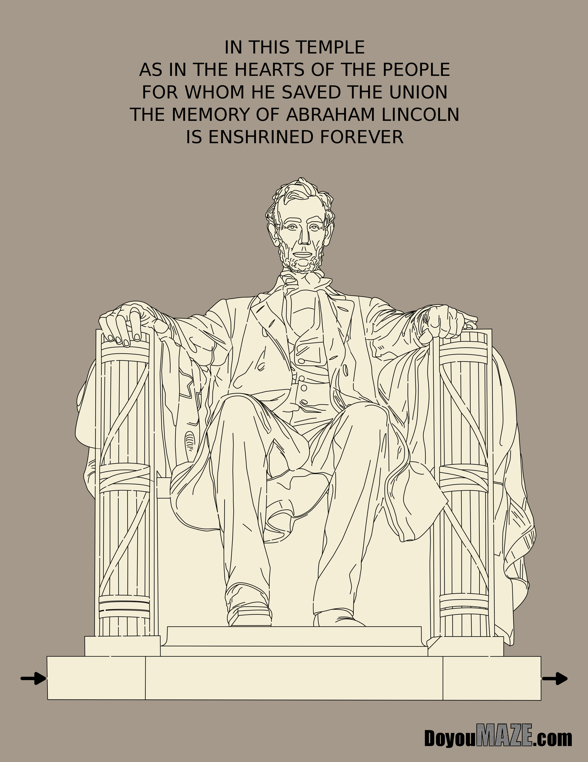
The maze I update today is not very popular on the website. For that reason I left it in black and white for a long time. Does anyone need a maze of this planetarium ? I guess not. But I enjoyed making it anyway. And so I finally gave in and tried to make it better. Here is the original blog post:

Maze of the Week #99 - Berlin Planetarium

Here are the enhancements I made to improve the maze:

1. Colored the Maze. A simple statement that covers a lot - I colored everything…

2. Recolored the planetarium. I switched the color of the dome portion to have grey lines vs. black to better reflect the actual building.

3. Textures added. I textured the grass and bush so they didn’t look so flat.

4. Pathway Enlarged. I changed the width of the maze pathways from 2 to 3, +50% to make solving more enjoyable, and easier.

5. Added shadows. To the planetarium and silo, to the front steps, and side walls, and the bushes…basically wherever it was needed.

6. Changed branding color. From black to white so it is more visible in the grass.

7. Changed Title. I increased font size slightly on both the title and the location. I also changed Germany to Deutschland so everything is in German

8. Added a sky.

Let’s see the before and after:

I like the new maze better. Slightly better.

Some data: The new file is 1088MB from 68MB.

I will be the new color version with the new maze going forward as an option. You can find the maze download there !

If you like this type of content check out all of my case studies:

A Collection of Maze Design Case Studies to Improve your Mazes

Happy maze-ing !

Maze of the Week 8 Redux - Abraham Lincoln Maze (MOTW#164)

Abraham Lincoln was a great President and I have made him into a maze 4 times ! One of those times became my maze of the week #8 that featured the statue of him that sits in the Lincoln Memorial in Washington DC. Today I attempt to improve upon that maze. It was a challenge, so let’s see what I did and see if I was successful. Here is the original post:

Maze of the Week #8 - Abraham Lincoln Maze

Here are the enhancements I made to improve the maze:

1. Changed the Pathway Width. Increased the size of the pathways by 50% to make solving easier. This is more apparent when printed to solve.

2. Re-colored the Maze. I changed the background color and statue color. Lighter brown tone for the wall and a brighter grey for the marble.

3. Start/Goal changes. I deleted the arrows and changed them to be the written out words START and GOAL.

4. Reoriented the Maze. I moved the maze to align with the bottom of the page. This also distanced the quote on the wall behind him above his head.

5. Shadows Added. I spent a lot of time working on shadows for this statue. This took up the majority of my time and it was tedious work. I also added some shadows to the back wall.

6. Branding Changes. I reduced the branding tag by 75% and pushed it into the shadows of the corner.

Let’s see the before and after:

After the changes I see a maze similar but different. Did it improve ? I’m not sure. Either seems ok to me.

Some data: The new file is 2910MB from 499MB.

I will be adding the new version of the maze as an option going forward.

If you like this type of content check out all of my case studies:

A Collection of Maze Design Case Studies to Improve your Mazes

Happy maze-ing !

Maze of the Week 38 Redux - Hoover Dam (MOTW #162)

This maze was never one of my favorites. I was practicing making landscape mazes and this seemed like a cool location to maze. In reality the maze was a bit weak. It looks kind of flat. But once I put so much time in making it I was worth publishing. Now, I get a chance to improve it. How will it go ? Let’s find out ! Here is my original post which includes a link to a great video about the dam if you are interested.

Maze of the Week #38 - Hoover Dam Maze

Here are the enhancements I made to improve the maze:

1. Dam changed. I added texture to the dam face and added light colored lines to show the shape and construction of the dam face better

2. Water changed. I added interest to the water in the reservoir and the water below the dam. I “marble-ized” it and think it is an improvement on the flat water before.

3. Added texture. I added texture to all of the rock areas. This changed the color of the earth some.

4. Added drought. I added an anti-shadow to highlight the low water in the reservoir by showing the previous water height. This is the same technique I use to make a shadow, but instead of using black I used white.

5. Added the sky.

6. New Start/Goal. The start and goal are now internal words vs. arrows. I also changed their location so I could improve the maze and use more of the page. Which means we have a

7. New Maze Pathway. I think this improves the enjoyment of the maze when solving.

8. New title font. I changed the title font to a more condensed look.

9. Added branding. I added my branding in the lower portion of the dam near the goal. It is at an angle near the water to fit into the picture.

Here is the before and after:

For all the changes it looks relatively similar. I think it still is improved.

Some data: The new file is 1,340MB from 123MB. 10X bigger.

I will be replacing the homepage with the new maze going forward. You can find the maze download there !

If you like this type of content check out all of my case studies:

A Collection of Maze Design Case Studies to Improve your Mazes

Happy maze-ing !

Maze of the Week 45 Redux - Air Force Cadet Chapel (MOTW#161)

This is one of the first mazes I made in perspective view vs. flat. It inspired me to try new ways of making future mazes. I find the architecture of this building to be wonderful. I don’t think I captured it in my initial maze and so I wanted to go back and try to improve it. Here is my original post for reference:

Maze of the Week #45 - Air Force Cadet Chapel Maze

Here are the enhancements I made to improve the maze:

1. Re-oriented the maze. I lowered the chapel on the page to show more sky.

2. Added a wall. I added some minor wall detail to the bottom of the maze so the building was no longer floating.

3. Added horizon elements. I added ground in the horizon at the back of the chapel and I added a building in the background bottom right. I also added a sky !

4. Start Goal Changed. Switched from arrows to START and GOAL written out. It fits better and looks better. Then I also changed the positions of each in the maze.

5. New Maze. As I made the changes I realized I wanted to re-do the maze - so it is completely new. In order to so this I extended various panels to create more of a grid like structure on the roof to make the maze. I also increased the pathway size through walls to make them easier to navigate.

6. New colorations. I colored the side window panels dark navy and changed the pane decoration to grey from black and white before to more accurately reflect the chapel. Changed the railing color from black to grey. And, oh yeah, I colored the entire maze !

7. Added many new details. I added new detailed inner window on front right of the church (previously this was left out). I added 3 sets of doors in front (previously shown as only blocks). I added a second hand rail on the front steps - previously I only had one set. I changed the internal panels (on the rook) from curved ends to flat ends to better reflect the actual building structure

8. Added branding. Added my branding to the bottom right corner (there was none before)

9. Title changes. Changed the font of title, reduced the size of location and added USA, while changing the color from black to white.

10. Added Shadows. A building like this has many shadows that make it more interesting so I added some.

And here is the before and after:

When you see a picture of the Chapel the white building pops against the blue sky background. I think this new version captures this. I prefer the new version by a wide margin.

Some data: The new file is 283MB from 99MB.

I will be replacing the homepage with the new maze going forward. You can find the maze download there !

If you like this type of content check out all of my case studies:

A Collection of Maze Design Case Studies to Improve your Mazes

What I've Learned Making Mazes

Happy maze-ing !