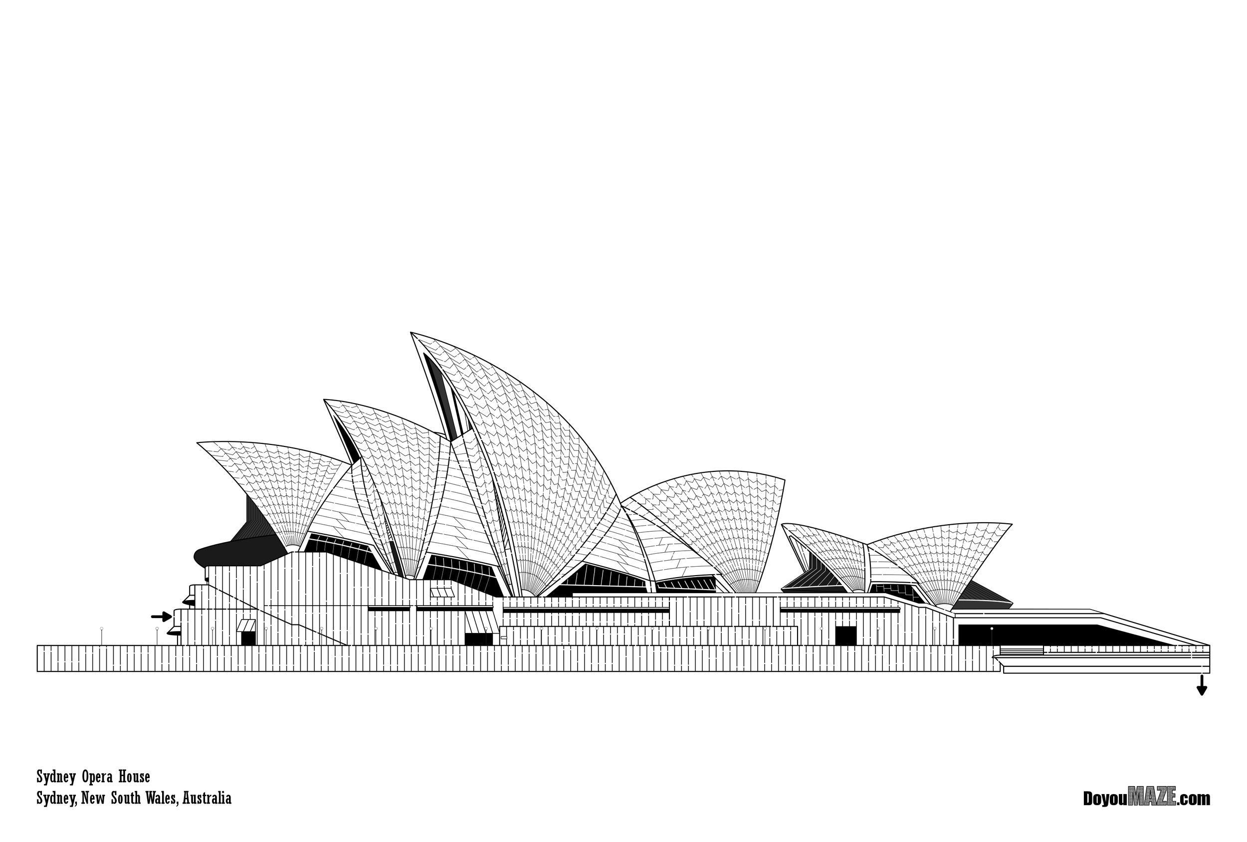
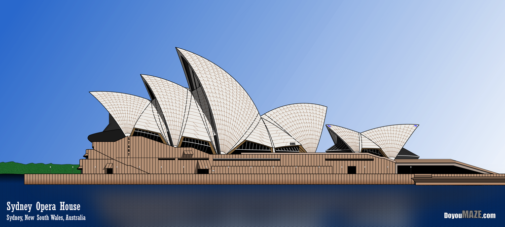
The Sydney Opera House Maze is one of my most popular mazes and one of my earliest. I have been looking wanting to update and improve it for a long time, but I knew it needed a lot of work. Well, I finally went for it and made it into MOTW #159 . Below is the case study showing what changes I made and why. But first, here is the original post for the maze:
Maze of the Week #42 - Sydney Opera House Maze
Here are the enhancements I made to improve the maze:
1. Changed the size. The original size was a very large 27 x 40; I reduced the height to change to 18 x 40 to better reflect the maze size and eliminate empty space. Still large.
2. Changed title font size. It was changed from 40 to 64 but I kept location font the same size so the title is featured vs the location.
3. Changed font color. I changed the titles from black to white based on a change below….
4. Re-oriented the maze. The new size also meant the Opera House would look better by moving it lower on the page and to the right.
5. Extended the building. Previously the building stopped on the right side, but now it more accurately flows off the page on the right side.
6. Added water. I added water with waves so the SOH wasn’t floating on the page any longer (and led to me changing the font color)
7. Added water stain discoloration. The bottom of the sea wall that surrounds the opera house is darker from the water and I added this detail.
8. Changed Start/Goal. I switched to an internal Start and Goal. Create a new maze !
9. New Maze. I switched the location of the start and goal to remove the portions in the base which was too easy and boring. So there is a new maze…actually…
10. 2 Mazes ! Much like the Taj Mahal, the space led to making multiple mazes in the same picture, so you get 2 for 1 mazes now !
11. Color Changed. I changed the color of the roof panels from black to brown to be more accurate - because an even more accurate lighter color does not show maze well enough. I also changed the roof color from white to pearl to be more accurate.
12. Added a reflection. I think any time you can add a reflection in the water, and can do it well, you should do it. It really elevates the maze.
13. Pathway Improvement. I increased pathway width from 3 to 4 (+33% larger) to make solving easier and more enjoyable.
14. Added shadows. Mostly along the roofline and around awnings.
15. Added a shoreline. Because there is one IRL.
So that was a lot. I hope you agree the improvements were worth it ! This is a very large maze so the bigger the screen you use to view it the better !


Huge improvement. Well worth the time I spent updating.
Some data: The new file is 386MB from 307MB.
I will be replacing the homepage with the new maze going forward. You can find the maze download there !
If you like this type of content check out all of my case studies:
A Collection of Maze Design Case Studies to Improve your Mazes
Happy maze-ing !
