Maze of the Week 59 Redux - QRO Walking Street (MOTW #171)

This was an experimental maze for me. I had never made a maze of a scene before and I like how it came out. It made the finalist for maze of the year on this site and got some #1 votes. The reason is not so much the maze but the nice colors of the buildings - thanks to the wonderful people of Mexico ! I also used a photo I had taken to make the maze (shown below for comparison). I wanted to give it an update using some new techniques. Here is the original blog post:

Maze of the Week #59 - Walking street in Queretaro, Mexico

Here are the enhancements I made to improve the maze:

1. Added textures. I added texture to all the bushes and the trees. They looked too flat before. Then I added textures to the walls of buildings - first 2 on the left, the first, and third buildings on the right, and the back building. I wanted the walls to look more like stucco. This did change some building colors. Oh, and also the dirt under the plants now includes some texture also.

2. Building Fix. I had to make a minor line fix on the 3rd building on the right to fix design mistake (seen only if zoomed in).

3. Sign Changed. I changed the colors of the the Q sign to be more accurate.

4. Pathways Size. I changed the pathways by increasing their size by 25% to make solving easier.

5. Sign fixed. There was an error in how the La Bar Condesa sign was previously colored - I corrected it.

6. Quality Improved. The quality of the picture improved by using a new saving technique - best seen when zoomed in - i.e. the number on the door on the building on the right is most apparent.

Here is my photo with the before and after mazes:


Some data: The new file is 1,280MB from 444MB.

I will be replacing the homepage with the new maze going forward. You can find the maze download there !

If you like this type of content check out all of my case studies:

A Collection of Maze Design Case Studies to Improve your Mazes

Happy maze-ing !

Maze of the Week 23 Redux - Wrigley Field Sign (MOTW#170)

I used to make a lot of sign mazes. Not so much anymore. I enjoy making them, but most of them are ignored. Except the famous signs. Some of those are ok. Which brings us to the Wrigley Field Sign Maze. It is a simple maze, and I made it in color. Looking back, I don’t like that it is floating on the page. So I am updating it. Here is the original post:

Maze of the Week #23 - Wrigley Field Sign Maze

Here are the enhancements I made to improve the maze:

1. Changed the Start/Goal. I switched start and goal to internal - with words instead of arrows to allow me to work on the outside portion of the sign.

2. Added the Background. I added a background, including the base of sign that holds it to the stadium, windows, stadium pillars, and fencing. All of this to give it a more realistic look and stop it from floating on the page.

3. Added Texture. I gave the concrete portion of the stadium some texture to make it look more realistic.

4. Maze resized. I changed the maze to be 11.5 x 7.5 vs regular letter size. It looks better.

5. Branding Changes. I moved the branding into the window and switched it to vertical to integrate it into the maze more. I also changed the branding to white from black.

6. Sign message change. I changed the message on the sign, and added lights that are out for more realism. “Home of the Chicago Cubs” is permanently on the sign - no need to repeat it.

7. Background details. I added bolts onto the steel beams to show more detail and I added blinds in the windows behind a see through windowpane - they are hard to see without zooming in.

Let’s check out the before and after:

I think both mazes work, but of course I prefer the new one best !

Some data: The new file is 566MB from 24MB. Much bigger !

I will be replacing the homepage with the new maze going forward. You can find the maze download there !

If you like this type of content check out all of my case studies:

A Collection of Maze Design Case Studies to Improve your Mazes

Happy maze-ing !

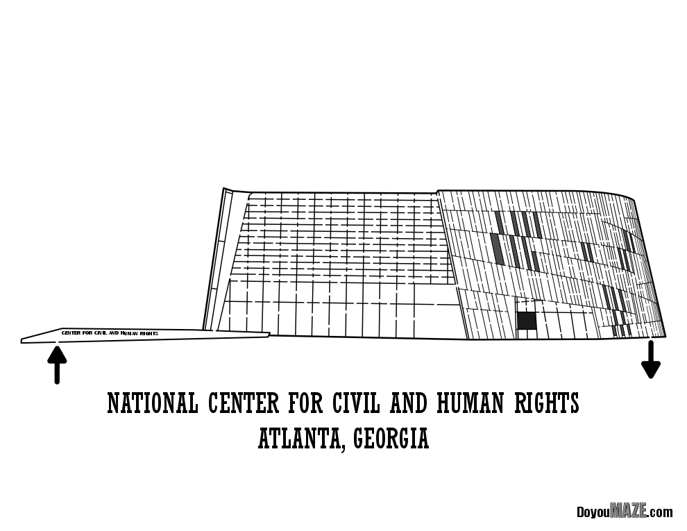
MOTW# 25 Redux - National Center for Human and Civil Rights (MOTW#169)

This is my second archived maze that is being re-done. The first was the Museum of the North in Alaska. What is in the archive ? Basically, mazes that few people care about. But I care about this maze, and so I improved it. Here is the original post:

Maze of the Week #25 - National Center for Civil and Human Rights Building Maze

So this is the 3rd time I touched this maze. It was originally only in black and white, then I took the time to colorize it.

Here are the enhancements I made to improve the maze:

1. Changed the Size. Changed the height from 7 to 5.3 inches, which I used to reduce the lawn size ! Then I changed the width from 14 to 13.2 inches and reduced the empty space on the left of the building.

2. New Title Size. I used a new smaller font on title

3. Branding Changed. I reduced the branding size by 15%. On the smaller size the brand was too large.

4. Arrows Changed. I reduced the size of the start and goal arrows by 35% so they weren’t so overpowering.

5. Minor Pathway Changes. I made it so there are slightly wider entrance and exit pathways to the maze.

6. Nook Changed. I used a new shadow technique used on front of the building nook that changes the color to be more accurate (from greenish to a dark yellow).

7. Lawn Changes. I added texture to the lawn. I thickened the reeds on the right side at the exit. I added a new hill on left in the horizon.

8. Windows Changed. I changed front window tiles from black to dark charcoal to be more accurate. You won’t notice.

9. Added the Sky.

Here is the before before and the before and after:

Better ? Yes. A lot better ? Maybe. The change from black and white to the new version is more drastic than the intermediate step.

Some data: The new file is 616MB from 58MB.

I will be replacing the archive with the new maze going forward. You can find the maze download there !

If you like this type of content check out all of my case studies:

A Collection of Maze Design Case Studies to Improve your Mazes

Happy maze-ing !

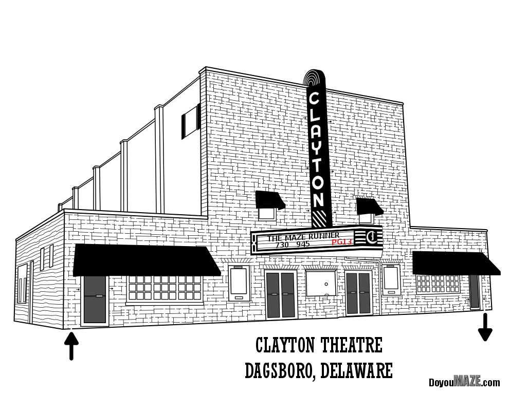
Maze of the Week 13 Redux - Clayton Theatre (MOTW #168)

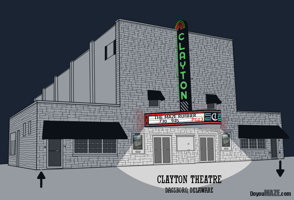
This maze update is going to be different from the other options I have done. I like the original maze and wanted to make a new version of it - a view of the theatre at night. When I originally made the maze I remembered seeing pictures of the building at night with colors that were not what I was expecting. I wanted to add those onto the maze and see how it looked. It also allowed me to practice some design techniques. Here is the original blog post:

Maze of the Week #13 - Clayton Theatre Maze

Here are the enhancements I made to improve the maze:

1. Neon added. I added glowing neon lights to top of the sign, blue lights around the C on the sign and around the marque. Basically I added neon lights, then made sure that they would glow.

2. Building glow. That also meant adding sign glow onto the building from neon signs, not just the area directly around the lights.

3. Windows darkened. I should have done this on the daytime version also.

4. Arrows changed. Unfortunately I had to use internal arrows in this maze to jump obstacles. The internal arrows are now 20-30% larger where possible.

5. Posters added. I added The Maze Runner poster to the poster boards !

6. Nighttime. I added a dark night sky and added a deeper grey on everything to show it was night.

7. Size changed. I took an inch off the height to eliminate some empty space.

8. Font Size. I reduced font size on title, with even more reduction on the city name

9. Light added. I added a bright light on the front of the building at the box office.

10. Minor Detail. A new ticket box office color/detail where the ticket seller speaks. Very small detail, but more accurate.

I prefer the night version, but I will keep both on the site. Maybe I should make some of the same changes on the daytime version ???? TBD.

Some data: The new file is 233MB from 112MB.

I will be posting this maze on the homepage in addition to the existing version. You can find the maze download there !

If you like this type of content check out all of my case studies:

A Collection of Maze Design Case Studies to Improve your Mazes

What I've Learned Making Mazes

Happy maze-ing !