The 43rd type of maze construction I will “how to” is the Mobile Maze. Like some of our other mazes, most notably, the Kids Maze, this type of maze can look many ways and have many different constructions, but it is still has distinct characteristics to properly execute ! Let’s define what a Mobile maze is then get into the step by step instructions !
Mobile Maze - A Maze designed specifically to be viewed and solved on a mobile device.
HOW TO MAKE A MOBILE MAZE
Step 1 - Choose the Maze construction
This seems like an odd Step 1, but it is correct. Similar to a Kids Maze, the Mobile Maze can be created dozens of different ways. Take a look at the How To Draw a Maze section and choose the look you prefer. You will actually be following THOSE sets of instructions while following some basic rules to make the maze look good on mobile ! Also note that some objects lend themselves to this maze construction - a giraffe would be good, as would a anything long.
Step 2 - Follow the instructions + add these rules
Follow the instructions of the maze construction you selected while adding these 2 rules:
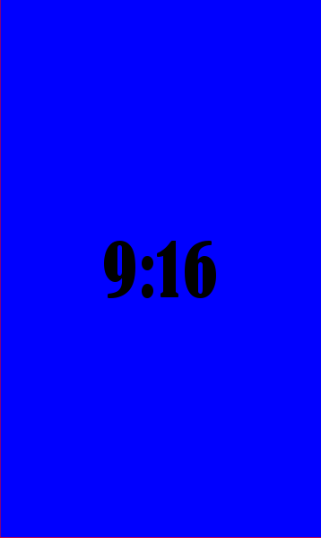
Design the maze vertically using a 9:16 ratio or greater. The 9:16 ratio is the standard size for a mobile screen (you can read more about screen sizes below) . An easy way to think of this is that you want a maze about twice as high as the width. If you want a maze to be scrollable in order to be solved (this adds some difficulty !), try for a larger ratio like 1:4. What do I mean by that ? Well in a scrollable maze a dead end may be off the visible screen - in fact you might even design your maze with this in mind to make it more challenging !
WHAT A 9:16 RATIO LOOKS LIKE
2. Make pathways that are WIDE. This is a vague but important design feature. I find that a bit of testing is needed to get this just right. If you design digitally it can easily be adjusted (and this is for mobile, so I assume that it is) in order to have a maze that can be solved easily. For Grid based mazes (Grid Maze, Color Grid Maze, Arrow Maze, Block Move, etc.) the widest # of blocks I would suggest using is 5.
Let’s look at a few different Mobile Maze examples:
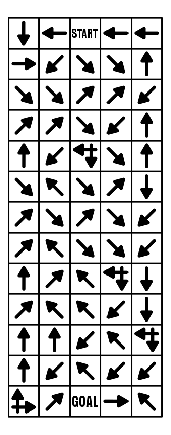
Here is an example of a Mobile Arrow Maze, that is a 5:13 ratio, and because it is an Arrow Maze, no pathway adjustments are needed ! Because the maze is long the solver cannot see the Goal when they start solving it !
And here is an example of a Mobile Grid Maze. Once again I used a 5:13 ratio. Notice how the pathways between grids are much thicker than usual. I more than doubled the normal width.
A Mobile Weaving Maze. 5:23 ratio, and with very wide pathways. I find that this construction needs more length than others to help establish more realistic false pathways. Still, this is a fun maze to make and solve in a mobile format.
And one more for fun. A Mobile Hidden Message Trail Maze. 5:18.
ADDITIONAL MOBILE MAZE EXAMPLES:
I have a section on the site of over 30 mobile mazes, that includes a free downloadable file of each of them (not really a book since the sizing is for mobile phones, and not for printing). And, although it does not have many words, if you prefer to read and solve laberintos en Español, tengo que aqui.
MAZE DESIGN BASED ON SCREEN SIZE:
Computer screen monitors vary in their aspect ratio, but most since 2012 are 16:9 (1.78), although through time they have varied from 1.25 to 1.60. So, yes, you are not imagining things, computers are getting wider. Some of you might even remember when televisions were a 4:3 aspect ratio (1.33) before they became much wider.
Most smartphones also happen to be a 16:9 (in landscape mode or 9:16 in portrait mode) which is convenient when you use landscape mode to watch YouTube or other videos on your phone. But when you are not watching videos, your phone is in portrait mode for just about everything else you use it for. Tablets have large range of ratios with many 4:3 like an old tv and some 16:10. This makes them a bit wider so that books get formatted as a priority over videos (you are reading with your tablet and not watching movies right ?).
So, when I make a maze for this website I am always thinking about how it will look on a large screen and how it will print on a standard size piece of paper (8.5x11) which is a 1.29 ratio. The mazes still look fine on a cellphone screen, but are not entirely solvable in most cases without zooming in to see the pathways more clearly. This means a lot more difficulty in maneuvering to solve a maze.
So when you make a maze those are the screens you might be making them for. And in this case, Mobile mazes you want to design for a 9:16 screen !
OTHER POSTS THAT MAY INTEREST YOU:
44 Different types of Mazes and Labyrinths


